PCA for 8-band satellite imagery with Python
purespatial.com/articles/pca-8-band-satellite-imagery-dask-python
Earlier writing, before the field-checked format.
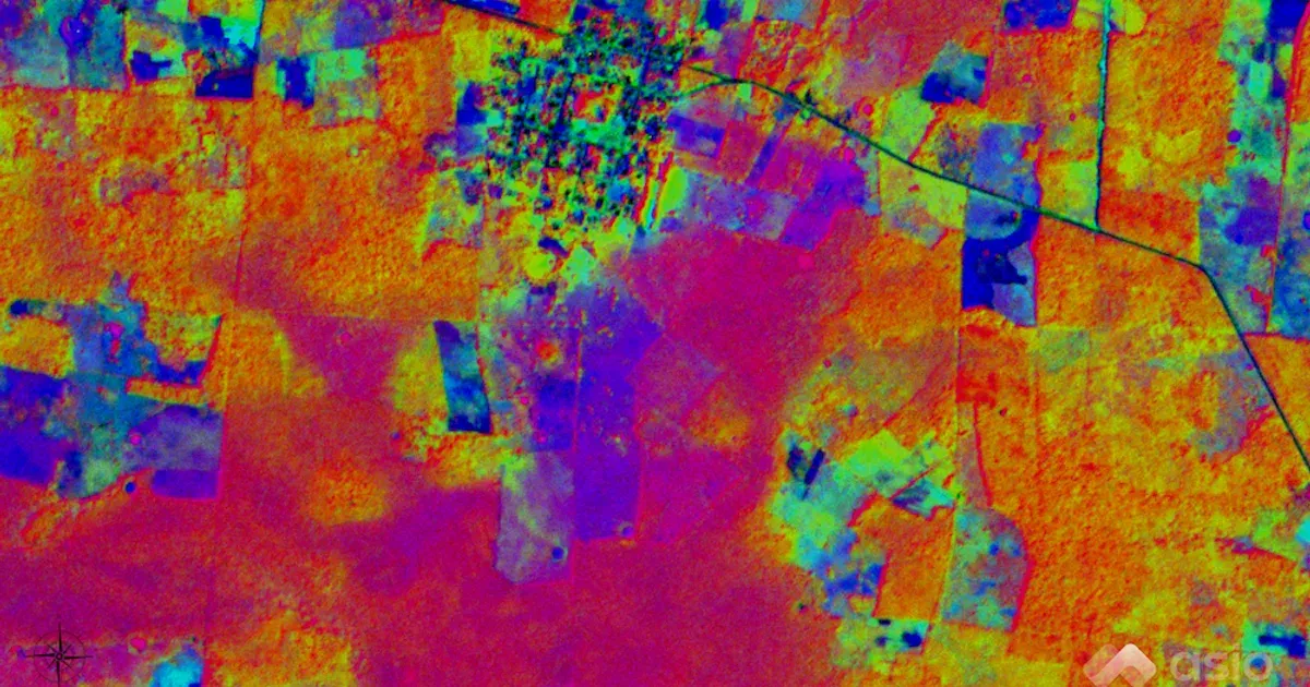
Create a standardized Principal Component Analysis (PCA) raster stack from 8-band multispectral satellite imagery. Python script at the end of the article. The full jupyter notebook is available here.
Background
Principle Component Analysis [1] is a technique for reducing the volume or dimensionality of a complex dataset while preserving as much of the information as possible.
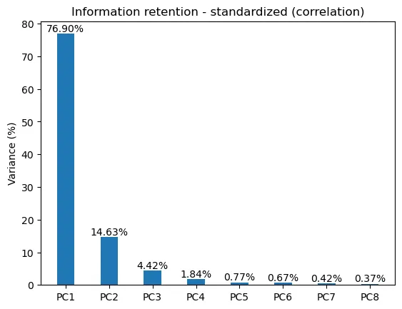
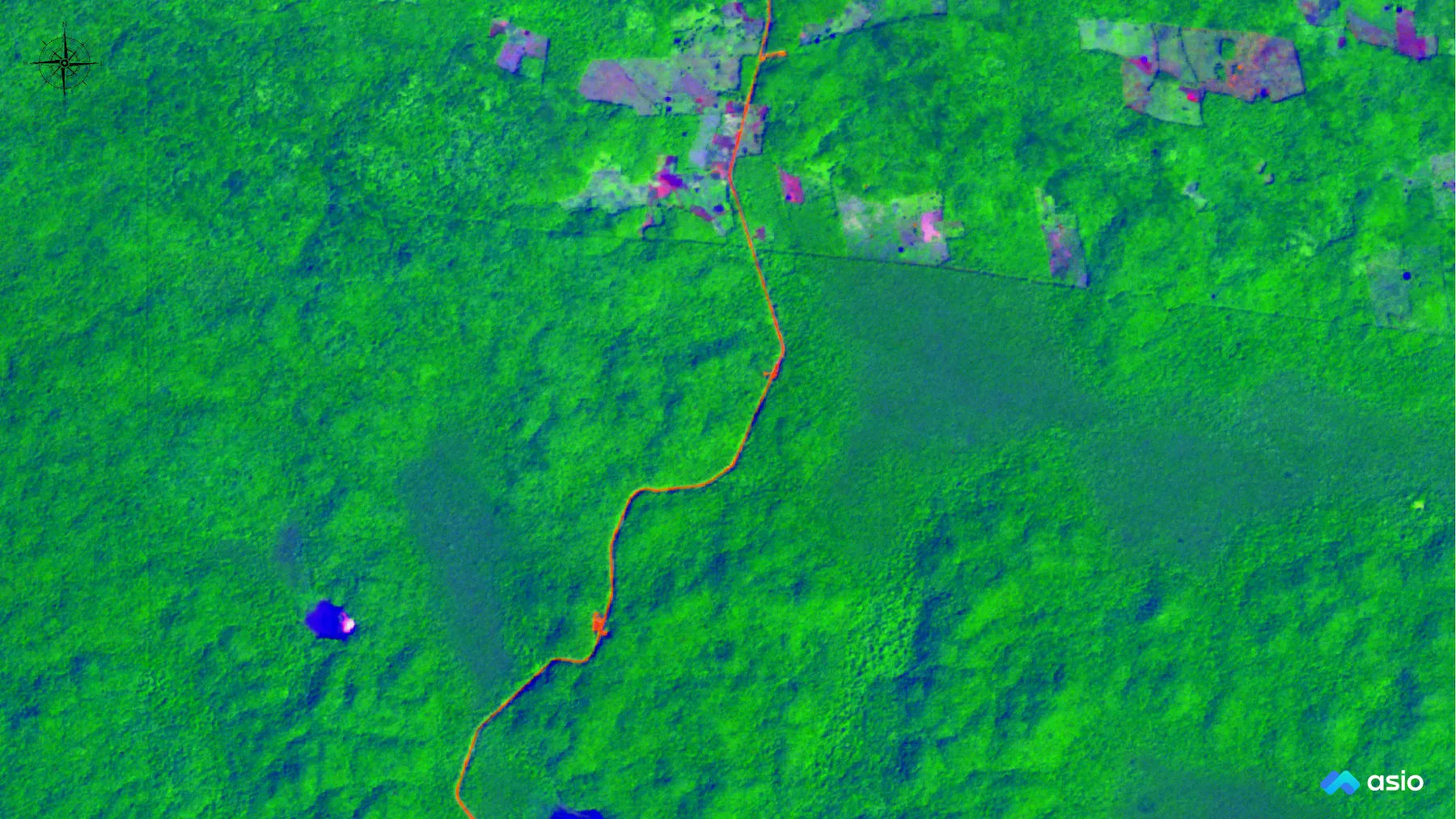
In this workflow we will see how a PCA can reduce an 8-band satellite image into a 3-band image while preserving over 95% of the information.
Data
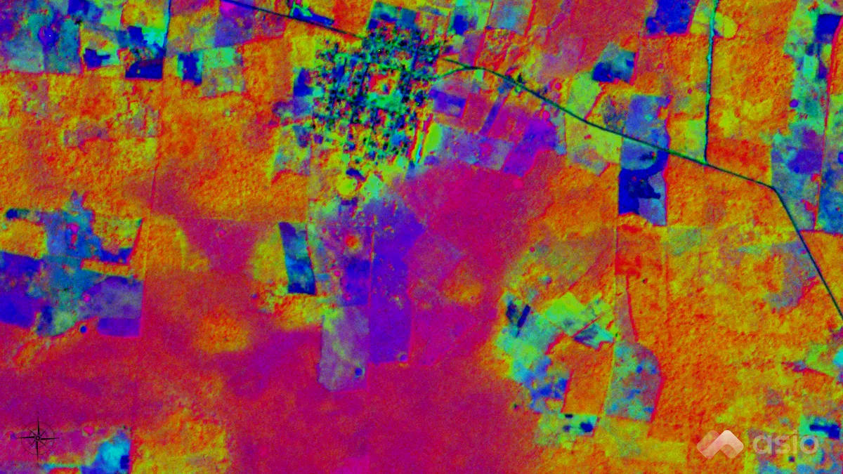
For this exercise we will be evaluating a single scene from Planet Labs SuperDove [2] constellation. The earliest imagery available is from around mid-March, 2020. The constellation is acquiring new imagery of the entire planet almost daily.
Each SuperDove scene covers approximately 32.5 x 19.6 km (637 km²), and has a spatial resolution of about 3 meters. Each scene file is about 980Mb on disk. A small example dataset is available in the jupyter notebook repo or at the following link [3].
Load Data
First, our libraries and data…
from rasterio.plot import show
import seaborn as sns
import matplotlib.pyplot as plt
import pandas as pd
import numpy as np
import dask.array as da
import rasterio

filename = './data/analytic/demo.tif'
src = rasterio.open(filename)

n_bands = src.meta['count']
img_shape = src.shape

band_numbers = ['1', '2', '3', '4', '5', '6', '7', '8']
pc_names = ['PC1', 'PC2', 'PC3', 'PC4', 'PC5', 'PC6', 'PC7', 'PC8']

band_names = ['coastal_blue',
              'blue',
              'green_i',
              'green',
              'yellow',
              'red',
              'red_edge',
              'nir']
Summary Statistics
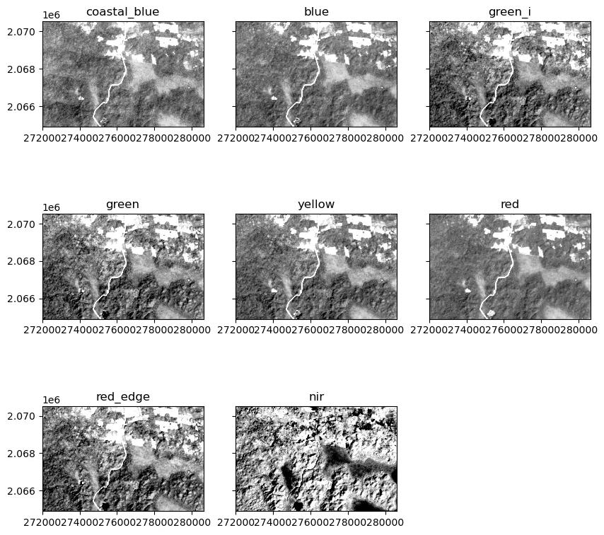
Now, we will look at the raw data and it’s distributions.
stats_raw = []

for idx, band in enumerate(src.read()):

    stats_raw.append({
        'band': idx + 1,
        'min': band.min(),
        'mean': band.mean(),
        'max': band.max(),
        'std': int(np.std(band)),
        'var': int(np.var(band)),

    })

summary_stats = pd.DataFrame.from_records(
    stats_raw, index='band').astype(int)

summary_stats
Table 1. Summary Statistics for Surface Reflectance Values.
| band | min | mean | max | std | var |
|---|---|---|---|---|---|
| 1 | 1 | 104 | 2024 | 49 | 2456 |
| 2 | 1 | 78 | 2183 | 51 | 2686 |
| 3 | 8 | 230 | 2346 | 72 | 5192 |
| 4 | 37 | 311 | 2686 | 83 | 6925 |
| 5 | 17 | 210 | 2582 | 82 | 6804 |
| 6 | 1 | 118 | 2670 | 84 | 7156 |
| 7 | 120 | 767 | 3664 | 142 | 20305 |
| 8 | 460 | 3763 | 5970 | 385 | 148705 |
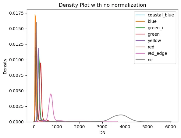
Here we can see band 8, the NIR band, tends to have values much larger than the other bands. We will use a min-max normalization and the correlation matrix to produce a standardized PCA.
Look at the Data
vals = []
for idx, band in enumerate(src.read()):
    vals.append({
        'band': idx + 1,
        'vmin': int(band.mean() - np.std(band)),
        'vmax': int(band.mean() + np.std(band)),
    })

fig, axes = plt.subplots(
    nrows=3,
    ncols=3,
    figsize=(10, 10),
    sharey=True)

ax1, ax2, ax3, ax4, ax5, ax6, ax7, ax8, ax9 = axes.flatten()

fig.delaxes(ax9)

# plots
show((src, 1), cmap='Greys_r', ax=ax1,
     vmin=vals[0]['vmin'], vmax=vals[0]['vmax'])
show((src, 2), cmap='Greys_r', ax=ax2,
     vmin=vals[1]['vmin'], vmax=vals[1]['vmax'])
show((src, 3), cmap='Greys_r', ax=ax3,
     vmin=vals[2]['vmin'], vmax=vals[2]['vmax'])
show((src, 4), cmap='Greys_r', ax=ax4,
     vmin=vals[3]['vmin'], vmax=vals[3]['vmax'])
show((src, 5), cmap='Greys_r', ax=ax5,
     vmin=vals[4]['vmin'], vmax=vals[4]['vmax'])
show((src, 6), cmap='Greys_r', ax=ax6,
     vmin=vals[5]['vmin'], vmax=vals[5]['vmax'])
show((src, 7), cmap='Greys_r', ax=ax7,
     vmin=vals[6]['vmin'], vmax=vals[6]['vmax'])
show((src, 8), cmap='Greys_r', ax=ax8,
     vmin=vals[7]['vmin'], vmax=vals[7]['vmax'])

# add titles
ax1.set_title('coastal_blue')
ax2.set_title('blue')
ax3.set_title('green_i')
ax4.set_title('green')
ax5.set_title('yellow')
ax6.set_title('red')
ax7.set_title('red_edge')
ax8.set_title('nir')
bnd_list = []
for i in range(n_bands):
    bnd = da.from_array(src.read(i+1))
    bnd_list.append(bnd)

dask_band_stack = da.dstack(bnd_list)
dask_band_stack = dask_band_stack.rechunk('auto')
src_sr = dask_band_stack.compute()
A good way to visualize the distribution of pixel values across the 8 bands is to use a kernel-density-estimate plot from seaborn. For the smaller example image this takes about a minute.
for i in range(n_bands):
    sns.kdeplot(src_sr[:, :, i].flatten())

plt.title('Density Plot with no normalization')
plt.xlabel('DN')
plt.ylabel('Density')
plt.legend(band_names)
Normalize the data
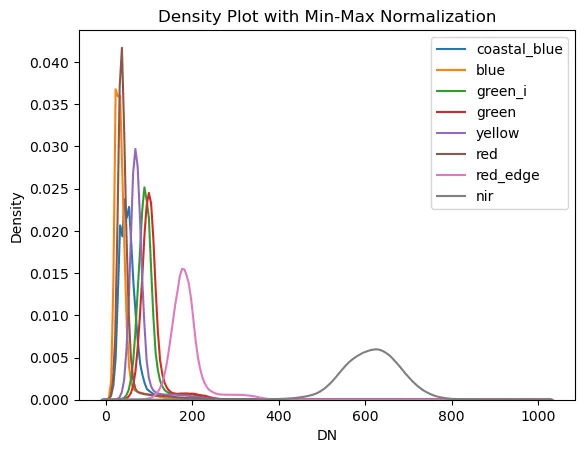
Because the values in the NIR band (band 8) are so much larger than the other bands it can skew the correlation and eigen values, so we will perform a min-max normalization on the data first. Also, calculating correlation coefficients requires us to flatten the data from a 3-dimensional matrix down to a two-dimensional matrix. the band layers are preserved, but the rows and columns of the image are cast into one long vector. We will reshape the data before we are done.
flat_bnds = np.zeros((src_sr[:, :, 0].size, n_bands))

for i in range(n_bands):
    bnd_i = src_sr[:, :, i].flatten()
    bnd_norm = 1024*((bnd_i - bnd_i.min())/(bnd_i.max() - bnd_i.min()))
    flat_bnds[:, i] = bnd_norm
stats_norm = []
for i in range(n_bands):
    band = flat_bnds[:, i]

    stats_norm.append({
        'band': i + 1,
        'min': band.min(),
        'mean': band.mean(),
        'max': band.max(),
        'std': int(np.std(band)),
        'var': int(np.var(band)),
    })

smry_norm = pd.DataFrame.from_records(
    stats_norm, index='band').astype(int)
Table 2. Summary Statistics for Normalized Values.
| band | min | mean | max | std | var |
|---|---|---|---|---|---|
| 1 | 0 | 52 | 1024 | 25 | 629 |
| 2 | 0 | 36 | 1024 | 24 | 591 |
| 3 | 0 | 97 | 1024 | 31 | 996 |
| 4 | 0 | 105 | 1024 | 32 | 1034 |
| 5 | 0 | 77 | 1024 | 32 | 1084 |
| 6 | 0 | 44 | 1024 | 32 | 1053 |
| 7 | 0 | 187 | 1024 | 41 | 1695 |
| 8 | 0 | 613 | 1024 | 71 | 5135 |
# look at data
for i in range(n_bands):
    sns.kdeplot(flat_bnds[:, i])

plt.title('Density Plot with Min-Max Normalization')
plt.xlabel('DN')
plt.ylabel('Density')
plt.legend(band_names)
Correlation Matrix
To calculate the Eigen Vectors and Eigen Values we need to compute the correlation matrix.
Using the correlation coefficients instead of the covariance matrix creates a standardized PCA. Eastman and Fulk, 1993, Carr, 1998
(citation) suggests the standardized PCA is better for change detection.
cor_lists = np.corrcoef(flat_bnds.transpose())

cor_data = pd.DataFrame(
    cor_lists,
    columns=band_numbers,
    index=band_numbers,
)

cor_data = round(cor_data, 2)
Table 3: Correlation Coefficients
| band | 1 | 2 | 3 | 4 | 5 | 6 | 7 | 8 |
|---|---|---|---|---|---|---|---|---|
| 1 | 1.00 | |||||||
| 2 | 0.80 | 1.00 | ||||||
| 3 | 0.73 | 0.88 | 1.00 | |||||
| 4 | 0.72 | 0.87 | 0.97 | 1.00 | ||||
| 5 | 0.77 | 0.92 | 0.94 | 0.94 | 1.00 | |||
| 6 | 0.79 | 0.94 | 0.89 | 0.88 | 0.95 | 1.00 | ||
| 7 | 0.63 | 0.77 | 0.92 | 0.94 | 0.88 | 0.79 | 1.00 | |
| 8 | -0.02 | 0.00 | 0.23 | 0.24 | 0.07 | -0.05 | 0.36 | 1.00 |
Eigen Values and Vectors
EigVal_cor, EigVec_cor = np.linalg.eig(cor_lists)

std_eigVec_table = pd.DataFrame(
    EigVec_cor,
    columns=band_numbers,
    index=band_numbers
)

std_eigVec_table = round(std_eigVec_table, 3)
std_eigVec_table
Table 4: Eigenvectors
| band | 1 | 2 | 3 | 4 | 5 | 6 | 7 | 8 |
|---|---|---|---|---|---|---|---|---|
| 1 | 0.331 | -0.212 | -0.854 | 0.341 | -0.008 | 0.001 | 0.020 | -0.001 |
| 2 | 0.379 | -0.165 | -0.073 | -0.630 | -0.129 | 0.042 | -0.460 | -0.444 |
| 3 | 0.392 | 0.098 | 0.154 | 0.104 | 0.538 | 0.355 | -0.431 | 0.448 |
| 4 | 0.391 | 0.113 | 0.192 | 0.182 | -0.330 | -0.726 | -0.235 | 0.272 |
| 5 | 0.394 | -0.062 | 0.167 | -0.038 | -0.610 | 0.508 | 0.331 | 0.269 |
| 6 | 0.382 | -0.201 | 0.071 | -0.345 | 0.448 | -0.280 | 0.638 | 0.061 |
| 7 | 0.368 | 0.261 | 0.275 | 0.487 | 0.107 | 0.094 | 0.125 | -0.669 |
| 8 | 0.062 | 0.891 | -0.311 | -0.293 | -0.016 | 0.006 | 0.127 | 0.062 |
# Ordering Eigen values and vectors
# and projecting data on Eigen vector
# directions results in Principal Components

order2 = EigVal_cor.argsort()[::-1]

EigVal_cor = EigVal_cor[order2]
pc_values_cor = (EigVal_cor/sum(EigVal_cor)*100).round(2)
value = sum(pc_values_cor[0:3])
print(f'variance accounted for by first 3 components of the std: {value}%')
variance accounted for by first 3 components of the std: 95.95%
What Does It Mean?
We can determine correlation between the original bands and the newly calculate principle components by calculating a table of factor loadings [4]
In the table below, we see that PC8 has the highest factor loadings with the NIR and Red Edge bands, so PC1 has retained most of the information in those bands.
PC8, however, has very low factor loading values and contains mostly noise.
loading_cor = pd.DataFrame(
    EigVec_cor * np.sqrt(EigVal_cor) / np.sqrt(np.abs(cor_lists)),
    columns=pc_names,
    index=band_names,
)

loading_cor = round(loading_cor, 3)
loading_cor
Table 5: Principle Component Loadings
| band | PC1 | PC2 | PC3 | PC4 | PC5 | PC6 | PC7 | PC8 |
|---|---|---|---|---|---|---|---|---|
| coastal_blue | 0.820 | -0.257 | -0.594 | 0.154 | -0.002 | 0.000 | 0.005 | -0.002 |
| blue | 1.050 | -0.178 | -0.046 | -0.259 | -0.033 | 0.010 | -0.096 | -1.276 |
| green_i | 1.137 | 0.113 | 0.091 | 0.040 | 0.137 | 0.087 | -0.082 | 0.161 |
| green | 1.145 | 0.131 | 0.116 | 0.070 | -0.084 | -0.179 | -0.044 | 0.096 |
| yellow | 1.117 | -0.070 | 0.102 | -0.015 | -0.151 | 0.121 | 0.065 | 0.170 |
| red | 1.067 | -0.224 | 0.045 | -0.141 | 0.114 | -0.065 | 0.131 | 0.047 |
| red_edge | 1.154 | 0.322 | 0.170 | 0.193 | 0.028 | 0.025 | 0.023 | -0.191 |
| nir | 1.255 | 16.126 | -0.387 | -0.230 | -0.014 | 0.006 | 0.039 | 0.011 |
fig, ax = plt.subplots()

pc_bars = ax.bar(
    [1, 2, 3, 4, 5, 6, 7, 8],
    (EigVal_cor/sum(EigVal_cor)*100).round(2),
    align='center',
    width=0.4,
    tick_label=pc_names,
)

plt.bar_label(pc_bars, labels=[f'{x/100:.2%}' for x in pc_bars.datavalues])
plt.ylabel('Variance (%)')
plt.title('Information retention - standardized (correlation)')
Create the PCA components for the Imagery
PC_std = np.matmul(flat_bnds, EigVec_cor)  # cross product

print(PC_std.shape)
(5385876, 8)
stats_std_PC = []
for i in range(n_bands):
    band = PC_std[:, i]

    stats_std_PC.append({
        'band': i + 1,
        'min': band.min(),
        'mean': band.mean(),
        'max': band.max(),
        'std': int(np.std(band)),
        'var': int(np.var(band)),
    })

smry_std_PC = pd.DataFrame.from_records(
    stats_std_PC, index='band').astype(int)
Table 6: Summary statistics for the standardized principal components.
| band | min | mean | max | std | var |
|---|---|---|---|---|---|
| 1 | 25 | 265 | 2541 | 78 | 6206 |
| 2 | -4 | 586 | 1001 | 69 | 4890 |
| 3 | -548 | -135 | 136 | 23 | 552 |
| 4 | -270 | -82 | 80 | 17 | 311 |
| 5 | -93 | -4 | 72 | 6 | 36 |
| 6 | -48 | 7 | 79 | 5 | 31 |
| 7 | -92 | 73 | 269 | 10 | 116 |
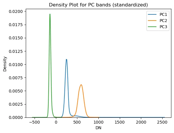
| 8 | -74 | -7 | 168 | 8 | 76 |
Reshape to image stack
PC_std_2d = np.zeros((img_shape[0], img_shape[1], n_bands))
for i in range(n_bands):
    PC_std_2d[:, :, i] = PC_std[:, i].reshape(-1, img_shape[1])

for i in range(3):
    sns.kdeplot(PC_std_2d[:, :, i].flatten())

plt.title('Density Plot for PC bands (standardized)')
plt.xlabel('DN')
plt.ylabel('Density')
plt.legend(pc_names[0:3])
PC_nrm = np.zeros(PC_std.shape)

for i in range(n_bands):
    PC_i = PC_std[:, i]
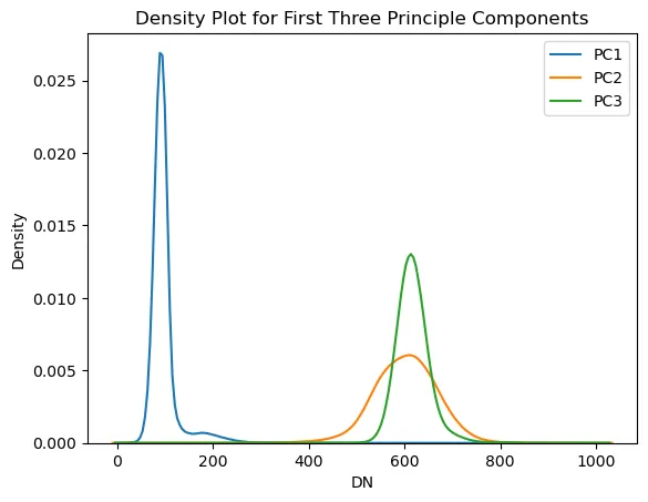
    pc_norm_mm = 1024*(PC_i - PC_i.min())/(PC_i.max() - PC_i.min())
    PC_nrm[:, i] = pc_norm_mm

PC_std_2d_norm = np.zeros((img_shape[0], img_shape[1], n_bands))
for i in range(n_bands):
    PC_std_2d_norm[:, :, i] = PC_nrm[:, i].reshape(-1, img_shape[1])
for i in range(3):
    sns.kdeplot(PC_std_2d_norm[:, :, i].flatten())

plt.title('Density Plot for First Three Principle Components')
plt.xlabel('DN')
plt.ylabel('Density')
plt.legend(pc_names[0:3])
# Set spatial characteristics of the output object to mirror the input
kwargs = src.meta
kwargs.update(
    dtype=rasterio.float32,
    count=8)
# band, row, col
tmp_std_norm = np.moveaxis(PC_std_2d_norm, [0, 1, 2], [2, 1, 0])
PC_img_std_norm = np.swapaxes(tmp_std_norm, 1, 2)
with rasterio.open('./data/analytic/0_derived/PC_img_std_norm.tif', 'w', **kwargs) as dst:
    dst.write(PC_img_std_norm.astype(rasterio.float32))
References and Links
- Wikipedia: Principle Component Analysis
- Planet Labs SuperDove Constellation
- Download Sample Planet Labs Data
- Factor Loadings
The full script
import rasterio
import dask.array as da
import numpy as np

filename = 'path/to/tif.tif'
src = rasterio.open(filename)

n_bands = src.meta['count']
img_shape = src.shape

bnd_list = []
for i in range(n_bands):
    bnd = da.from_array(src.read(i+1))
    bnd_list.append(bnd)

dask_band_stack = da.dstack(bnd_list)
dask_band_stack = dask_band_stack.rechunk('auto')
src_sr = dask_band_stack.compute()

flat_bnds = np.zeros((src_sr[:, :, 0].size, n_bands))

for i in range(n_bands):
    bnd_i = src_sr[:, :, i].flatten()
    bnd_norm = 1024*((bnd_i - bnd_i.min())/(bnd_i.max() - bnd_i.min()))
    flat_bnds[:, i] = bnd_norm

cor_lists = np.corrcoef(flat_bnds.transpose())

EigVal_cor, EigVec_cor = np.linalg.eig(cor_lists)
order2 = EigVal_cor.argsort()[::-1]
EigVal_cor = EigVal_cor[order2]

pc_values_cor = (EigVal_cor/sum(EigVal_cor)*100).round(2)

PC_std = np.matmul(flat_bnds, EigVec_cor)

PC_nrm = np.zeros(PC_std.shape)
for i in range(n_bands):
    PC_i = PC_std[:, i]
    pc_norm_mm = 1024*(PC_i - PC_i.min())/(PC_i.max() - PC_i.min())
    PC_nrm[:, i] = pc_norm_mm

PC_std_2d_norm = np.zeros((img_shape[0], img_shape[1], n_bands))
for i in range(n_bands):
    PC_std_2d_norm[:, :, i] = PC_nrm[:, i].reshape(-1, img_shape[1])

kwargs = src.meta
kwargs.update(
    dtype=rasterio.float32,
    count=8)

tmp_std_norm = np.moveaxis(PC_std_2d_norm, [0, 1, 2], [2, 1, 0])
PC_img_std_norm = np.swapaxes(tmp_std_norm, 1, 2)

with rasterio.open('./output.tif', 'w', **kwargs) as dst:
    dst.write(PC_img_std_norm.astype(rasterio.float32))

Jesse Sprague. Field-checked analyses of public wildfire data. Work: Echospectra.
purespatial.com/articles/pca-8-band-satellite-imagery-dask-python